neděle 31. října 2010

DEKADENCE NOW

Galerie Rudolfinum 30/9 2010 — 2/1 2011

Tip for lovely exhibition, specially recommended to visit with grandparents after Sundays lunch.


website of exhibition dekadence now here


Zhang Peng - Desiring Happiness N. 1 2007
Nobuyoshi Araki, Bondages

Paolo Schmidlin 2006

POSTAGE STAMPS BY TYPE DESIGNERS


Czechoslovakia. 1965 , Jewelry  Design by Josef Tyfa (1913–2007) was a Czech designer of logos, posters, book, and types. 


Switzerland. 1981, Europa , Design by Walter Haettenschweiler.


The Netherlands. 1969, 50th Anniversary of the  International Labor Organization. Design by Jurriaan Schrofer.


Great Britain. 1946 Victory. Design by Reynolds Stone


Germany. 1950. Seal of Johann Sebastian Bach. Design by Georg Trump


Poster Stamp 1909 Verein der Plakat-Freunde Berlin, Design by Lucian Bernhard


more of postage stamps you can find here


čtvrtek 21. října 2010

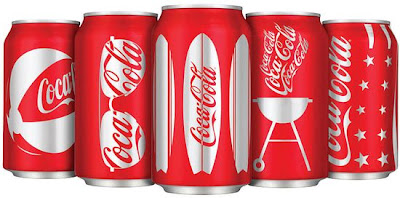
COCA COLA


The most known icon of the brand is Coca Cola bottle. First glass bottle prototype was designed and produced in US in 1916. Coca-Cola spokesman Bob Bertini acknowledges the shape's importance to the brand: "Nothing communicates the personality of Coca-Cola like the bottle. It strikes an emotional chord with consumers world-wide. People of all ages like its grip and feel and appreciate its aesthetic value, so we've been emphasising the bottle shape as the main visual cue in advertising campaigns and on-can graphics since 1993." Coca-Cola's production of bottles in the unique shape are further evidence of its intention to use the icon in all forms of communication.
summer edition by Turner and Duckworth

pondělí 18. října 2010

ANDY, KENNY AND KEITH,  ABSOLUT GUYS

Absolut vodka is currently world's best selling international premium spirit brand.
The brand, as well as the production facilities, is owned by the state of
Sweden. One of the key element of this brand is an iconic shape of vodka bottle,
this shape is supported by advertisting campaign, its repeated in different executions and
it became a strong symbol of this brand. The shape/form of the product was created 1978 when Absolut was known only in Sweeden. With the plan to expand to whole Europe and USA, Absolut people were looking for new innovations how to improve a bottle that would show the world that ABSOLUT VODKA stood for something different. The result was one of the key factor for the brand’s success. The inspiration for a bottle shape came from antique store in Old Town od Stockholm, in the shape of a traditional Swedish medicine bottle. To support brand values Clarity, Simplicity and Perfection, no label was ever printed on the bottle. All graphic part of design are printed directly on the glass. Thank to the simple shape, which was outstandig from other vodka product, Absolut became popular also as a piece of art. The bottle has been the centerpiece in more than 1,000 advertisements and is verywell known. Both the advertising and the packaging is outstanding and simple to remmember.


ANDY WARHOL


1985 Andy Warhol paint a picture of Absolut Vodka bottle and soon was followed by Keith Haring, Kenny Scharf and other well-known artists. Now the collection of contemporary art includes the work of more than 400 artists.


KEITH HARRING

neděle 17. října 2010

WATERLIFE

The interactive story of the last great supply of fresh drinking water on earth.


Waterlife is a documentary about the state of the Great Lakes that follows the flow of the lakes' water from the Nipigon River to the Atlantic Ocean. Using both documentary actuality and computer imaging, Waterlife begins at the primeval forests of Superior's north coast, stops at the baroque fountains of Chicago on Lake Michigan, continues to the rain-swept streets of Detroit and beyond, all the while examining how the greatest body of fresh water on Earth transforms the societies it passes through and is transformed by them.
The film's goal is to take viewers on a tour of an incredibly beautiful ecosystem that is facing complex challenges. Beyond that, Waterlife wants to bring viewers a visceral understanding of the element that is so integral to all of our lives.


No matter where we live, the Great Lakes affects us all. And as species
of fish dissappear and rates of birth defects and cancer rise, it seems
one think is clear, the Great Lakes are changing and something's not quite right with the water.A whole new class of chemicals, from pharmaceuticals to industrial chemicals, is showing up in our water. There is no clinical trial data on the long-term effects of these toxins. Bottled water is often touted as a solution, but it is often just repackaged tap water that has simply been through a few extra filters.


you can visit the interactive websites here

THE VILLEMOT SAGA AND 5 BRAND ATTRIBUTES OF ORANGINA

In 1953, Bernard Villemot created Orangina's first advertising campaign poster featuring a parasol shaped like an orange peel.

The poster conveyed a strong visual message, and the orange peel on a blue background set the groundwork for future communications. The breakthrough artwork signaled the birth of a great brand. Villemot understood
the importance of the brands five features which are still used today in all Orangina communications.
From the mid-1930s up until his death in 1989, Monsieur Villemot was one of Frances busiest, most illustrious poster artists. His bold strokes, vivid colors and trademark shapely girls were sketched with economy of line and form. Villemot’s working theory was that a good poster must be a telegram, and he fully lived up to that mantra, dispatching vibrant messages with clarity and wit.


5 ATTRIBUTES OF ORANGINA BRAND

A POWERFULL, WORDWIDE BRANDNAME evoking the name of the fruit, Orangina is a well-known brand in many countries
AN ICONIC BULBY BOTTLE
Since the birth of the brand, the original Orangina bottle
design has always evoked the orange.
Over time it has become the emblem of the brand.

AN EASILY RECOGNIZABLE LOGO
Orangina is easily recognizable, thanks to its logo made of an orange peel.
Since 2008, this logo has the shape of the bulby bottle
A UNIQUE RECIPE
Not less than 12% of citrus juice
A well-balanced taste thanks to a subtle blend of different citrus fruits (orange, lemon, grapefruit, mandarin)
2% of pulp, Light bubbles, Natural colors
and finally
A PERSONAL GESTURE/CONSUMERS RITUAL

before you drink Orangina you have to shake the bottle to mix the orange pulp.
The Orangina shaking gesture is shared by consumers all over the world.


In 2008, the Orangina swirl took the shape 

of the iconic bulby bottle design in the logo.

sobota 16. října 2010

THE MASTERS OF PROFESSIONAL STUDIES IN BRANDING IS AN AMBITIOUS ONE YEAR ADVANCED DEGREE PROGRAM FROM THE SCHOOL OF VISUAL ARTS. IT IS THE FIRST PROGRAM OF ITS KIND IN THE UNITED STATES AND OFFERS STUDENTS A UNIQUE OPPORTUNITY TO STUDY WITH SOME OF THE MOST ACCOMPLISHED BRANDING EXPERTS WORKING TODAY
for details have a look here


The students who enter this program will meet such a person like Malcom Gladwell, I personally recommend his book BLINK